Email marketing for land brokers can be the lifeblood of your real estate marketing. The demographic of these buyers of land have spent the last 30+ years living out of their inbox. Email is likely one of the first things they check after they awake in the morning and often times the last check before going to bed. Throughout the day the frequency of checking email is almost constant, especially now with everyone having a smartphone in their pocket. According to a study out of the University of British Columbia, the average person checks email 15 times a day. The study also showed that 92% of U.S. adults use email to communicate with others and 183 billion emails are sent and received each day (66,795,000,000,000 each year).
Needless to say you need to be doing email marketing and doing it really well. So, we are going to start by helping you with these 7 email marketing tips for land brokers:
1. Design for Mobile
 Did you know that almost half of email opens are now happening on mobile devices? The great folks over at litmus.com published some eye catching trends they’ve captured in email opens over 4 years.
Email opens on mobile devices were barely a blip on the radar in 2011, and made up just 8% of email opens. Then, fast forward to 2014 and nearly half of emails are opened on smartphones and tablets …that’s a 500% increase in just four years!
Based on some adjustments Gmail has made recently to their webmail, mobile, and desktop, Litmus calculated adjusted figures that open rates are 22% for desktop, 25% for webmail, and 53% for mobile. Of the mobile opens, 41% were on Apple iPhone & iPad and 7% on Android devices.
So the action item for land brokers is craft your emails in “mobile responsive” templates. What is mobile responsive? It is a web design aimed at building sites and emails for the most optimal viewing across a wide range of devices. Now, email templates can’t truly be mobile responsive as they still have to adhere to older coding methods to be compliant with email clients (i.e. Microsoft Outlook), but the images can scale and the entirety of the email should be easily read on a mobile device.
Almost all modern email marketing platforms provide mobile friendly templates you can customize, so ditch that old email layout you’ve been using for 5 years and move to a mobile responsive design.
2. Lead with imagery
As land brokers, you sell an extraordinarily enchanting product. Since that is a given, let’s maximize the visual appeal of your highly sought after and dreamed of product.
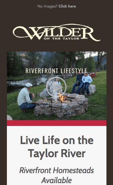
The header can be brokerage branding or a featured property photo with your brand watermark, BUT do now put a bunch of clickable links in the header. You’ve spend many hours pulling together this email to either feature 1 listing or a group of listings, but you’ve now distracted the email recipient with large amount of links to other sections of your website. Email 101: every email must have a purpose so stick with that purpose. If you want them to focus on 1 ranch or a small group of ranches, only offer links to those specific listings in the email.
3. Small photos just don’t cut it
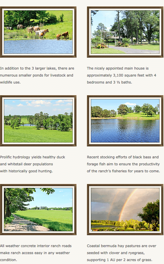
Too often I see land broker emails with thumbnail photos and feature highlights. Use larger photos and even cut the content down a bit if it means having larger photos displayed. Also just as important as larger photos, use enhanced photos to get more attention and clicks. There are many easy to use photo enhancement products available, so take advantage of this simple enhancement to your ranch land photos. Two good ones are Fotor and Canva. Notice the example in #4 below has multiple photos large enough to get a viewers attention versus photos 1/4 the size of those below. The standard email width is 600 pixels so when possible use 600px photos in your email.
4. Multiple Photos where Possible
Next, when the email campaign includes one or a small number of listings, include multiple photos of each property. Pictures say so much more than text. Pictures with a caption enable you to compliment the photo. With captions don’t just state the “feature”, but instead craft a statement that is intriguing. I also suggest putting links on every photo for a listing in the email campaign that directs the user to the ranch listing on your website.

5. Show highlights, spare the details
Land brokers as a whole seem to lead with product features. Thinking in features of the product (land) is the default first thought. As an industry we have to sell value and that value is the experiences a piece of land offers your buyer. So, why do we lead with acreage, price, and price per acre? Why can’t we lead with “abundant quail and deer population”, “legacy ranch property”, “turn-key sporting property”, “magnificent topography and views”, “family retreat and outdoor recreation”, etc. In an email campaign, value get’s buyers attention. Price and acreage immediately rules out or in the property for the buyer before you’ve ever had a chance to sell the value. Lead with value then features.
6. Create multiple links to your website listing page
Within any email campaign you have many opportunities to create links back to your website and listing. Use all of them – photos, text, and buttons. You don’t know what will spark someones interest enough to click to view more. Maybe it is the photo of large whitetail deer buck, equestrian barn, live water, children playing, or a call-to-action button. You don’t care how they get to the listing on your website, you just want them to get there.
7. Use Call-to-Action Buttons
This point is probably the most overlooked best practice in land broker email marketing. People will respond to a call-to-action (CTA) button over text link. Research shows most people scan email campaigns rather than reading them word-for-word, so that means buttons stand out to the skimmers. Buttons stand out because:
- Size
- Design
- Color
- Whitespace
Finally, a CTA button is exactly as it’s name suggests …an “action”. Experiment with your own action statements, but here are a few we consistently use for land brokers:
- View more photos
- Download Brochure
- Contact Us
- Visit Listing Online
- Learn More
- Check out Listing Here
CTA button examples:


We’ve given you 7 easy action items to improving your email marketing for your brokerage and most importantly your landowners. We trust you’ll put these to use in your next email campaign that will wow the client.
To get these and more helpful tips to selling land in the modern era of the internet, sign-up to get these articles sent right to your email inbox. Subscribe here.
