Not only have we been hard at work on software here at REALSTACK, but we’ve also been building stunning print ad designs for land brokerages. Print advertising is a staple in the marketing mix for land brokerages across the United States and they don’t come cheap. When land brokerages chose to do print ads they better have the chops to design a killer ad that is meant to impress and drive leads. Land brokerages call on REALSTACK for just that … print ad designs that impress potential leads to pick up the phone.
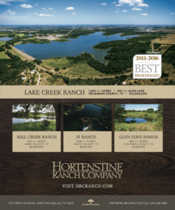
 One of our latest print ad designs for land brokerages is with Hortenstine Ranch Company in Dallas, Texas. We handle all the digital and print marketing for HRC. The latest is one of our favorites to be published in The Land Report this Winter 2016. Click image to view full ad.
Notables from the ad:
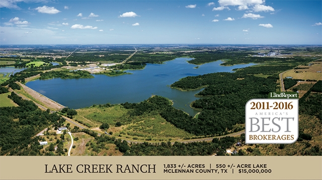
- Headliner ranch property. In this ad we had a clear alpha listing …550 acre lake on 1,800 acre. We made it front and center with an attention grabbing aerial photo of the massive lake. Now that we had their attention …
- Confidence badge. Maybe this is a new term to land brokers, but confidence badge(s) have been used for years by marketers to associate their business or product with already established brands, awards, or accolades. In this case, The Land Report Best Brokerages award is a highly distinguished list to be on as a land brokerage.
- Water. Clearly a critical attribute to any property is water and it sells very well in the market. We provided a gallery of listings with great water for ag use, recreational, livestock, fish habitat, and overall visual appeal.
- Limited listing information. Figuratively speaking, you have limited space on any print advertisement. Telling the full story or even a paragraph highlighting attributes of the property is overkill. The point is to get the phone to ring. So we advised to less text, information, or highlights and if a lead is interested they will certainly pick up the phone.
- Whitespace. You’ve probably seen excellent print advertisements and subconsciously thought how great that design looks. Apple is one of the best designers of whitespace. Often times designers use whitespace to create simplicity and focus. Too much information and imagery overload simply causes prospects to flip the page and move on. Too much to digest or consider.
- Website URL. We used a tasteful font size that fit the design and different color from the rest of the ad, so we were sure that viewers would see the brokerage website URL. If they are not motivated enough to call, then we certainly want them to go online for more information where we have a rockin website that captures lead email addresses …but that is another article.
- Color Palette. So often we see land brokerages that are not true to their brand or don’t really know what their brand colors are. In the case of this ad, we certainly made sure the colors used matched HRC design guidelines exactly.
The objectives of the ad was market top shelf properties, position the Hortenstine brand in the market as a high end brokerage firm, and get new visitors to their website. This ad accomplished all three objectives.
Hopefully we have given you points to consider for your next big spend on print advertising for land brokerage. Print design is very daunting when considering the amount of dollars your are about to invest. And invest is the keyword. An investment is an outlay of cash where you expect some return on those dollars in the future. Yes, you should expect some return on print advertising for land brokerages.
View more designs and digital marketing works from REALSTACK here: https://realstack.com/digital-marketing/marketing-portfolio/
