In today’s land market, your website is often a buyer’s first handshake with your business. Whether you’re selling a small recreational tract or a $100-million ranch, your site’s design directly impacts how buyers perceive you, and whether they take the next step.
Unfortunately, many land brokerages lose leads because of avoidable design mistakes. Let’s look at the top seven, and how to fix them.
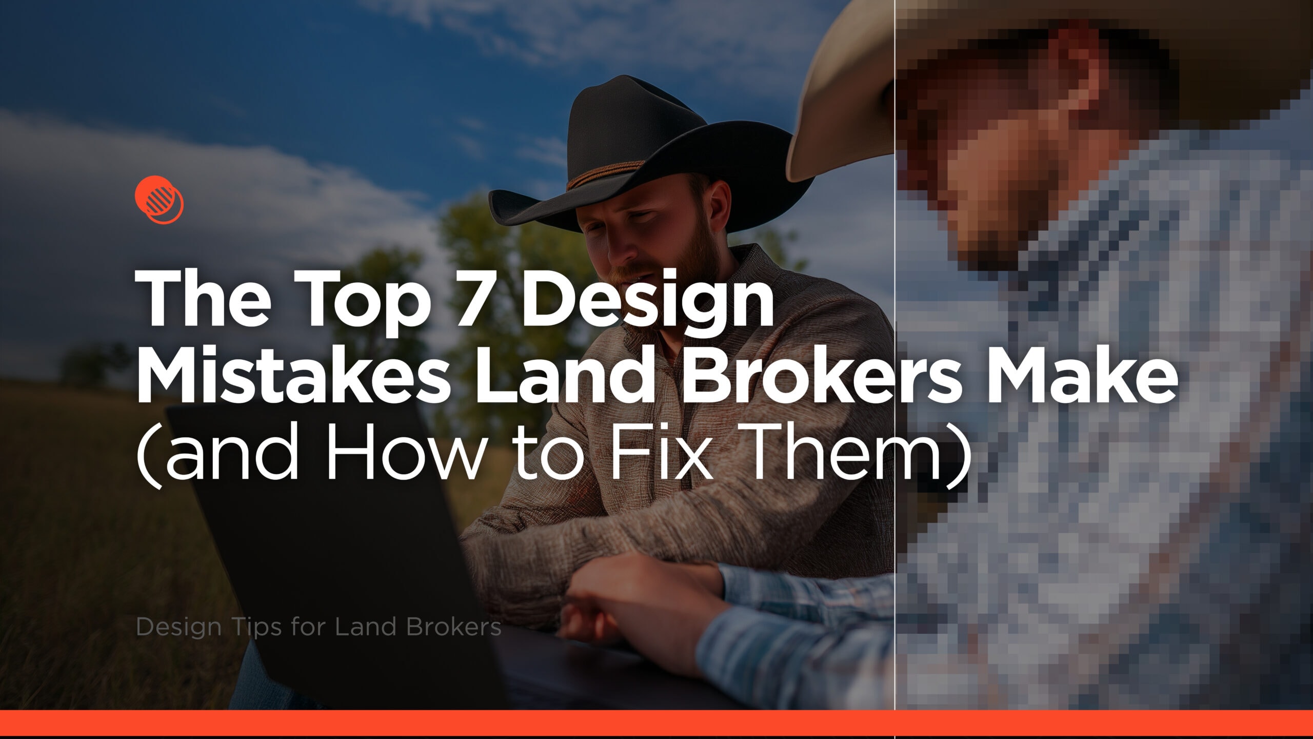
1. Poor Image Quality

The Problem: Grainy, over-saturated, stretched, or low-resolution photos instantly cheapen your listings. Serious buyers expect sharp, professional visuals.

The Fix: Invest in high-quality photography — aerial, ground, and drone shots where possible. Ensure your website is optimized for large, crisp images without slowing load times.
2. Unclear Navigation
The Problem: If buyers can’t find your listings or contact info within seconds, they’re gone. Menus that are cluttered, mislabeled, or buried behind multiple clicks cause friction.
The Fix: Keep your menu lean with clear, buyer-focused labels like “Search Properties” or “Map Search.” Make sure search tools are easy to spot on both desktop and mobile.
3. Outdated Design
The Problem: A site that looks like it hasn’t been updated in years signals to buyers that your business might be behind the times.
The Fix: Refresh your website’s look every 3–5 years to stay in line with modern design trends. Prioritize mobile-friendly layouts, clean typography, and an uncluttered, professional feel.
4. Slow Load Times
The Problem: Buyers won’t wait more than a few seconds for your site to load — especially on mobile. Large image files, outdated hosting, and excessive plugins all slow things down.
The Fix: Use optimized images, reliable hosting, and clean code. Run your site through tools like Google PageSpeed Insights to identify issues and improve performance.
5. Weak Calls to Action

The Problem: A “Contact Us” link buried at the bottom of the page isn’t enough. Buyers need to be prompted to take action at the right moments.

The Fix: Use clear CTAs like “Schedule a Showing” or “Get More Info” near property details, blog posts, and search results. Place them in multiple, visible spots on the page.
6. Ignoring Mobile Users
The Problem: Many land buyers browse listings on their phone. If your site isn’t mobile-friendly, they’ll move on to one that is.
The Fix: Use a responsive design so your site looks and functions perfectly on any device. Test your property search tools, images, and CTAs on multiple screen sizes.
7. Lack of Branding Consistency

The Problem: Using mismatched fonts, colors, and styles across your site weakens your professional image and confuses your audience.

The Fix: Develop a brand style guide that defines your colors, typography, logo usage, and image style. Apply it consistently across your website and marketing materials.
The Bottom Line
Design isn’t just about looking good; it’s about guiding buyers toward action. By fixing these common mistakes, you’ll create a smoother, more professional, and more persuasive online experience.
How REALSTACK Can Help
We design land brokerage websites with industry-specific tools, high-impact visuals, and conversion-focused layouts. From property search optimization to cohesive branding, we ensure your site works as hard as you do, attracting the right buyers, showcasing your properties at their best, and converting online visitors into qualified buyers.
Learn more about the most advanced land broker website system or visit REALSTACK.com.